01
Apple Maps
We can’t help but think that when Apple designed the flatter Apple Maps icon back in iOS 7 they rushed it somewhat. The updated maps icon in iOS 11 is a subtle hint to Apple’s new circular headquarters, but we like it as it’s got a degree of simplicity about it with an overall more polished look. The overlapping location indicator circle and the nicer blue border on the road number are just more aesthetically pleasing.
iOS 10
iOS 11
02
Reminders
Now you might be forgiven for taking a second glance at the updated reminders app icon. Not a lot has changed but it has lost a bullet and a line making the icon easier to recognise.
iOS 10
iOS 11
03
Calculator
The calculator app icon has long just been 4 buttons even before iOS 7’s radical re-design. However in iOS 11, Apple has brought the form factor of the calculator front and centre. We like it because it basically looks like the interface of the app itself.
iOS 10
iOS 11
04
Camera
The camera app icon has always been a favourite of ours mainly because it communicates exactly what the app does. The newer slightly re-designed app icon in iOS 11 is nicer because it’s less detailed and flatter in appearance. It’s funny how losing those small line details have made for a subtle but nicer look.
iOS 10
iOS 11
05
App Store
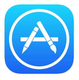
This is a slightly controversial choice and many Apple fan boys (and girls) out there would probably disagree with us, but we like the new App Store Icon. Afterall who designs apps with pencils and paintbrushes anyway? The icons still resemble an ‘A’ character and its modular stick design fits with app building.
iOS 10

iOS 11
06
Contacts
Here we have a new addition to our showcase of new App Icons in iOS 11. It’s another great example of an improved design since Apple’s app icons were last re-designed in iOS 7. They’ve scaled down the shadows, removed the ridiculously small letters on the tab and included a female silhouette for equality reasons obviously! We like it though, it’s more refined and simple. We also think the silhouettes look better framed in a circle.
iOS 10


iOS 11
This icon reconstruction was kindly donated to us by fellow graphic designer Ryan Vandeput. He too has a graphic design studio called The Vandeput Design Co. You can contact him at ryanvandeput.com/contact Big thanks to Ryan who saved us several hours painstakingly recreating the new Contacts app icon!
Apple has gone all out with iOS 11 making little tweaks to pretty much every app icon, most of which the end user will never notice but perhaps we’ll leave all that for another blog post! Only time will tell as we near to the final build of iOS 11 if any other app icons will be radically re-designed. Stay tuned!
Related Posts
5 Christmas gift ideas for Creatives
December 5, 2019
The awesome 2018 Brio Christmas Card
December 12, 2018
Our BBC Radio Interview
June 13, 2018
Our day at the Birmingham Design Festival 2018
June 11, 2018
10 things every designer can relate to
February 15, 2018
GIF OF THE WEEK! – 2017 RECAP
January 10, 2018
Brio New Year Studio Playlist
January 5, 2018
Awesome Christmas Gift Ideas for the designer in your life 2017
November 30, 2017
Brio Autumn Studio Playlist
September 12, 2017
5 must have back to university gadgets for creative students
September 8, 2017
‘It’s the little things that matter’
September 1, 2017
Audio, Visuals & Lighting at the NWHC Fashion Show
July 24, 2017
We sometimes dabble in animation as well
July 3, 2017
Apple WWDC and iOS 11 UI Design
June 13, 2017
SeaBrooks Rebrand – Our Thoughts
June 10, 2017
In the news 24.05.17
June 3, 2017
Framing Guide
May 19, 2017
Ikea Trip 07.05.17
May 10, 2017
Brio Store – It’s Finally Here
May 5, 2017
Brio Studio Tour
May 1, 2017
Norfolk, iPhone 7 Plus Camera Challenge
April 28, 2017
Design in Norfolk
April 25, 2017
Apple’s comical Earth Day Videos
April 24, 2017
Designer Daily Carry – Part one
April 7, 2017
In the news 29.03.17
April 7, 2017
Our awesome new print portfolio
March 30, 2017
The Fidget Cube [REVIEW]
March 28, 2017
Brio Studio Playlist [SPRING .17]
March 28, 2017
We love the new Red iPhone 7
March 21, 2017
Our awesome new website!
March 19, 2017
















Very Nice Work Done
Congratulations for the presence, very nice and clean work, and clever the idea and the knowhow to divide them in to 2 sections and slide view over them.
———————————————
About the icons designing :
Apple Maps : ok it was good, it is clearer to 11.
Reminders : gray parallele lines was too dark to 10 and the new one too light [and fat] to 11 > none , for small icons , 11 ‘s designing is better, for bigger sizes i prefer 10 to this icon.
Calculator : while this of 11 is more accurate for see the application image, that of 10 is clearer —> they could make a trick, but it may confuse the users, using for the big icon sizes the new 11, and for the small sizes the older icon [for example for smaller of 64×64 using the older] if i had to use one only then the 10.
Camera : same here but on the opposite, the older one of 10 looks better to the big icon sizes the new, and for the small sizes the new one which is more compact. if i had to use one only then may the 11.
App Store : same here the older one of 10 looks better to the big icon sizes the new, and for the small sizes the new one which is more compact. But if i have to choose iprefer the 10 one.
Contacts : the new 11 is more balance as picture, it has both male and female, shadow and no latin letters, so the new one is definitely good. 11 here.
——————-