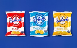
No lunch time in the studio is complete without a packet of crisps and we are partial to a packet of SeaBrooks every now and then. They have recently had a stunning rebrand by Leeds based agency, Robot Food, which we absolutely love.
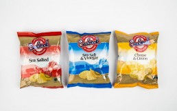
For anyone that doesn’t know already, SeaBrooks is a British company formed in 1945, manufacturing crinkle cut crisps. Fun Fact – the name was formed by mistake when founder Charles Brook gave his initials (C Brook) to a clerk at photo-processing shop, who mistaking wrote it on his film as SeaBrook. Hence the name was born.
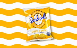
The brand refresh is incredibly loveable, it’s got a nostalgic feel about it exhibited by the impactful stripes and iconic colours used for each flavour. The loud striped design sits against a white background giving the packaging a mature clean look while keeping the heritage of the brand very much alive. The traditional logo has also evolved, moving the brand towards a more modern look and feel using updated graphics and a fresh punchy slogan “Bags of flavour, made with pride” giving the brand a new personality to go along with its loud visuals.
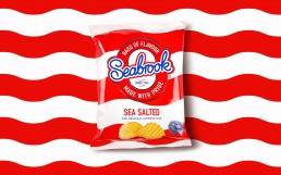
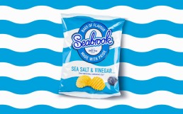
In such an over crowded market it’s important to stand out from competitors and this is certainly what Robot Food have achieved for SeaBrooks. They’re a brand that can no longer be missed while browsing the aisles of your local supermarket. It’s good to see that brands are daring to be different rather than sticking to what they know.
Robot Food will continue to guide SeaBrooks via they’re new comms and product development strategies. We look forward to seeing whats to come next.