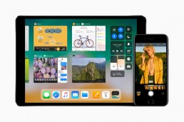
Last Monday marked the start of every Apple lovers favourite time of the year. It was the annual World Wide Developers Conference, where developers from all over the globe gather to see what’s next in terms of software advancements at Apple. They can also visit workshops and get advice for when they’re creating apps for Apple’s various platforms. Every year we love to follow all of the Apple hype and this year we were particularly interested in how they would upgrade the look and feel of their software platforms and enhance the user interfaces and experiences.
So say hello to iOS 11, not the overhaul we were expecting but we’re going to talk through all the subtle changes which we think makes the design of iOS both relevant and on-trend. Oh, and we’ll talk about all of the features that got us end users super excited for the Autumn launch.
The design

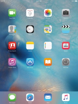
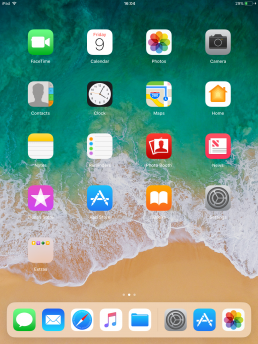
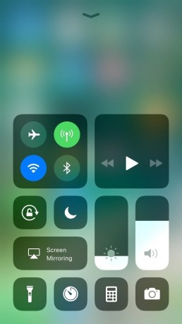
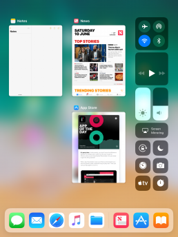
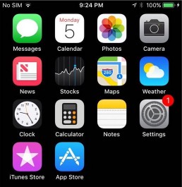
On the face of it, iOS 11 doesn’t look a whole lot different to its predecessor iOS 10. The basics are still with us. The same old home screen, the same app layout and for iPhones the dock hasn’t changed much either. To be honest, why change something that in terms of user experience works so well? Now for our own personal testing purposes, we’ve installed the developer beta on one of our iPad Mini’s and it’s this line of iOS devices that has seen the largest changes. We’re going to talk through design changes that affect both the iPhone and iPad but we’ll also pick out all of the user interface enhancements that are exclusive to iPad. The before and after picture below shows iOS 10 on the left and iOS 11 on the right.


01
Bolder text, everywhere!
The first thing you’ll notice when looking at iOS 11 is the typography and just how big and bold it’s become since iOS 10. Apple is clearly catching on to the bolder typography trend that we’re seeing on the design scene at the moment. Gone are the thinner weighted typefaces which are replaced for more bolder weights and tighter tracking for a bigger impact. The News app on iOS is a great example of this typography change, now for the keen eyed people out there you would say that the news app already looks like that in iOS 10 and you would be right but it’s the roll-out of this typography change onto other apps like the App Store, Notes and just about every other stock iOS app on the system that makes it a significant change this time round. We ourselves love this trend, you can see it across all our own brand material and on this very website.


02
The App Store
The App Store has had a major design interface revamp in iOS 11. It’s completely different to what we know and love (or hate). It was long overdue in our opinion as it was becoming increasingly difficult in terms of user experience to find new interesting apps to download. This design change will hopefully improve that by bringing new apps front and centre and making it easier to discover the new additions to the App Store. This is thanks to the new tiled interface which again is very on trend at the moment in UI design across the web and on various apps. Tiles make it easier to visualise content. They create a nice mix of image and text and are more inviting to tap and interact with. When we design websites we tend to use tiles for blogs and shop interfaces as they show users just enough information to make them want to explore more.
03
Control Centre, more control.
The Control Centre is another complete change from the previous version of iOS. Once again it uses a similar tiled interface approach to visualise all of the different switches and buttons that users can interact with. We’re not entirely sold on this design approach here it’s slightly clunky and some of the switches don’t look very polished but after all the software is still being developed so this might change. On the plus side though, Apple is letting users have more control (if you pardon the pun) by letting you customise the switches inside Control Centre to your personal liking.


04
The Dock & App Switcher on iPad
The biggest design interface changes that iOS 11 brings are for the iPad. iOS 11 for iPad takes features we all know and love from MacOS and re-imagines them for touchscreens. Now the iPad has a fully functioning dock where you can multitask, see open/recently used apps and drag apps to create split views. This fairly big change is great for user experience because it means users can now use their iPads much more efficiently and more like they would a proper computer. Another welcome change is the multitasking view which is now also a lot like Mission Control on MacOS. User experience has long been a criticism of the iPad. Most people said that it felt like they were just using a large iPhone, and they were right, but now this totally changes everything and the iPad now feels more like a middle ground between iPhone and Mac.
05
New App Icons
Some of the stock iOS apps have had new identities and by that, we mean updated App icons. From what we can see, three app icons have changed and, to be honest with you we’re not sure why! The App Store icon has lost its ring, the calculator has gone from 4 buttons to a miniature calculator and the iTunes icon, well, has lost its identity altogether. We have to say Apple, what were you thinking with the iTunes icon? It doesn’t have any continuity to the iTunes icon on the Mac at all. We do like the new App Store icon though even if it is has lost its ring, it looks cleaner and less cluttered.


So there we have it, 5 of the biggest design interface changes that iOS 11 brings to iPhone and iPad. It’s not the major overhaul we were expecting but the changes Apple have introduced will certainly help with user experience especially when using iPads. Here at Brio we always love to keep up to date with the latest design trends because it’s what we live and breath. Whenever we design web and digital projects we always do so with the user in mind and just like Apple we try to create design that looks great but functions well too.