During Easter, we both took separate trips to Norfolk for a nice relaxing break by the sea. It was a much-deserved break after working 14 weeks solid and we were glad of a nice rest to refuel our Brio batteries. Now we didn’t make it our mission to construct this blog but naturally like the designers we are, we can never escape from looking at design and appreciating when something looks great or when some design could do with some help.
This post, in particular, looks at some of the great examples of graphic design that we saw on our travels around Norfolk and we thought we’d give these places some recognition for doing great design work! Also, we didn’t want this post to be just mainly text talking about design. We think the photos shown here speak for themselves when we say that these places have well thought out and striking branding that is very on trend around the design scene at the moment.
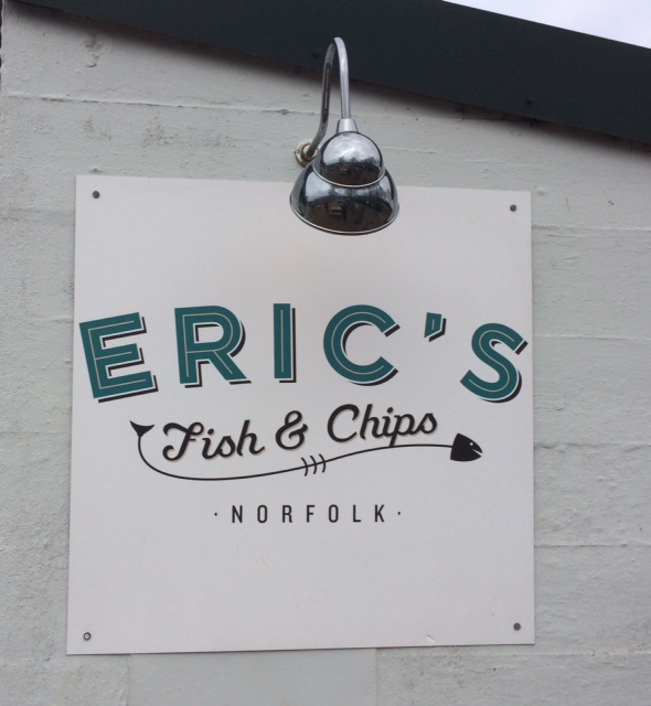
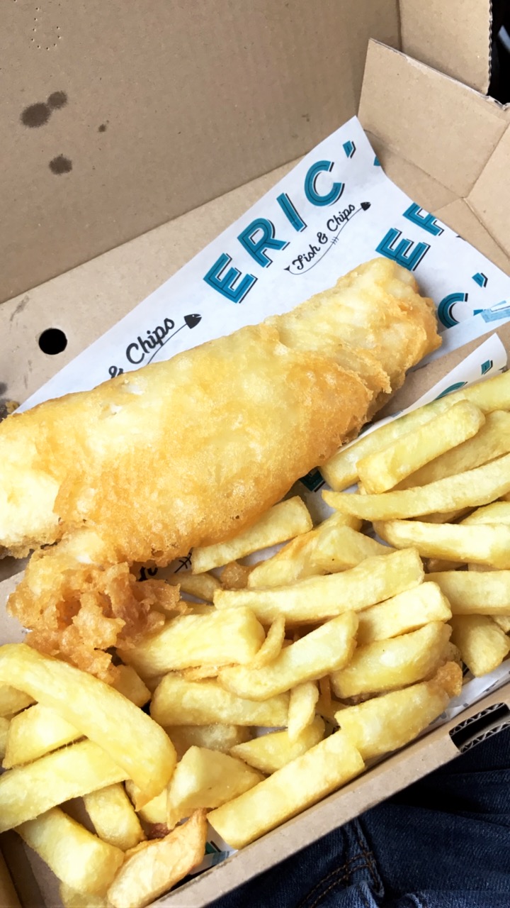
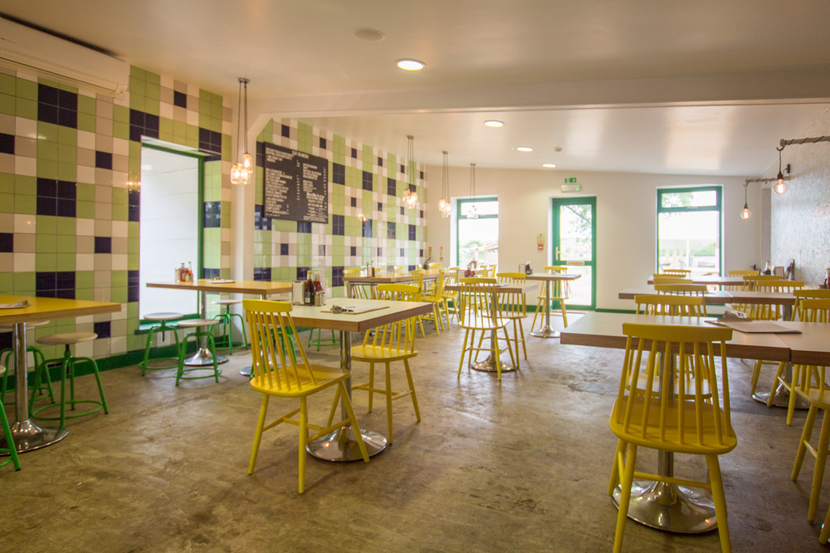
Eric's Fish & Chips
Thornham, Norfolk, UK
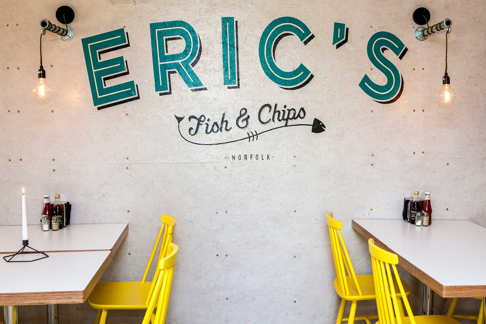
Eric’s Fish & Chips is relatively new to Norfolk. It’s based in Drove Orchards in Thornham just a little up the coast road from Hunstanton. Drove Orchards has expanded somewhat over the years from just being a farm shop to building outhouses with shops in them. Eric’s isn’t just your usual fish and chip shop though, it fry’s lots of different varieties of fish and best of all they have gluten free options for Alex! Eric’s branding shouts nostalgia perfect for the seaside. The colours, blue, yellow and green directly refer to the sea, sand and the landscape of Norfolk.
The shop itself also features a restaurant all of which has a very retro and rustic vibe which has obviously stemmed from their branding. The menus are displayed on retro peg boards and there are lots of vintages bulbs for lighting. We see this as great brand extension and it’s important that what customers see on paper such as a logo clearly transfers onto things like the interior design of a shop or restaurant. I think for us Eric’s stood out really well because you rarely see a fish and chip shop with such great branding and well-thought out design and that’s why it’s made it here.
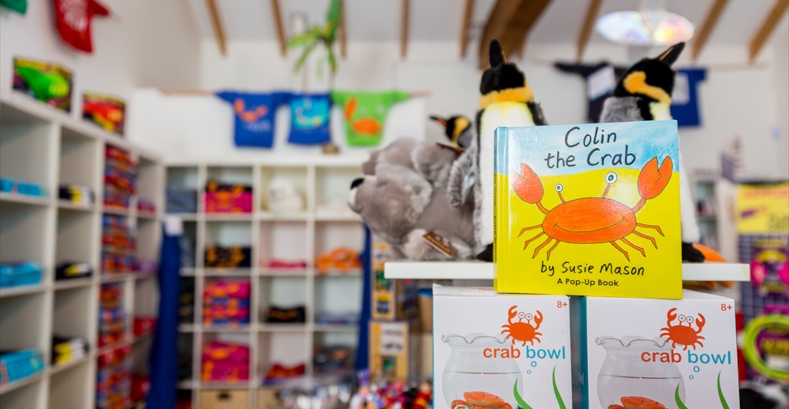
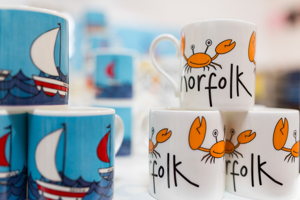
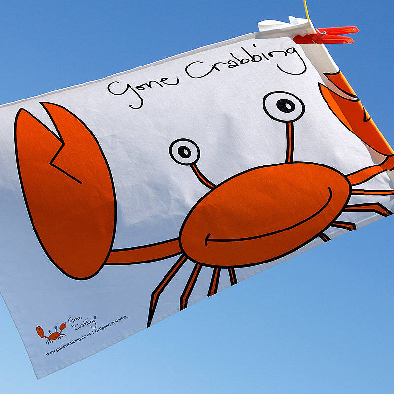
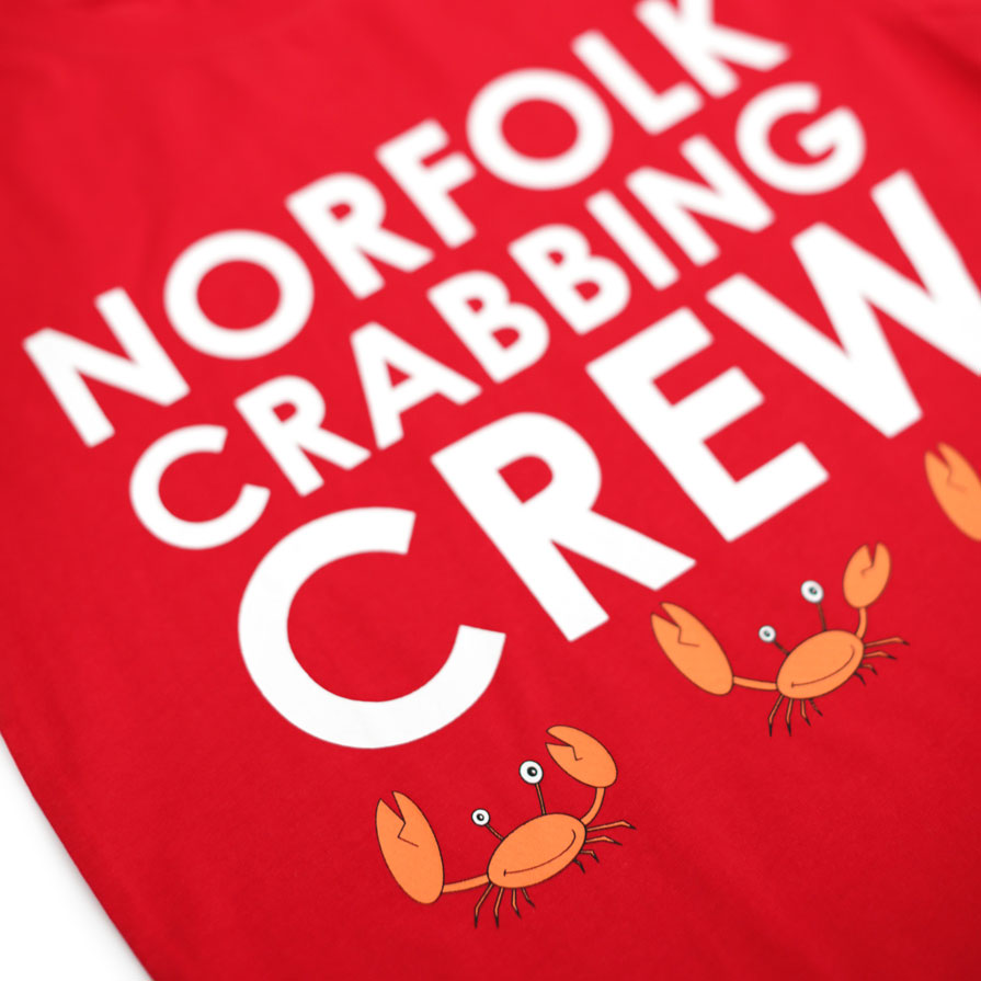
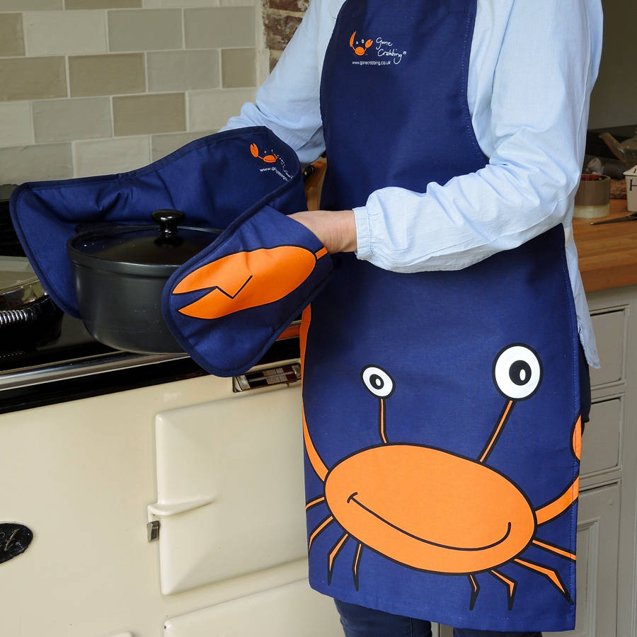
Gone Crabbing Store
Burnham Deepdale, Norfolk, UK
The Gone Crabbing store is located in Deepdale Market at Burnham Deepdale. It’s a gift shop that sells quirky seaside inspired items that have all been designed in-house. Gone Crabbing itself was launched in 2008 by Susie Mason who herself designs the fun and imaginative gifts that are sold inside the store. We really love the simplistic approach she uses when designing the merchandise. It’s all very charming and captures the British love for the seaside. Her inspiration comes from hours crabbing with her children on local quaysides in Norfolk. Susie chose the famous Cromer Crab as the basis for her colourful designs. Gone Crabbing’s popular little crustacean affectionately known as “Colin”, now features across Susie’s distinctive branding. Once again this brand is a great example of how a logo and look can transfer to everything customer facing. In this case, Susie’s style is seen on the many varieties of gifts she sells and so much so they’ve become distinctive around Norfolk.
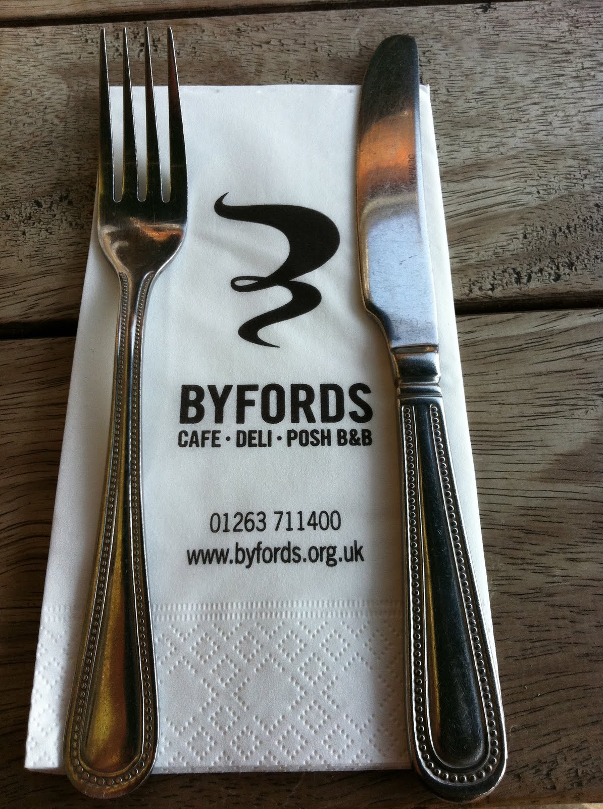
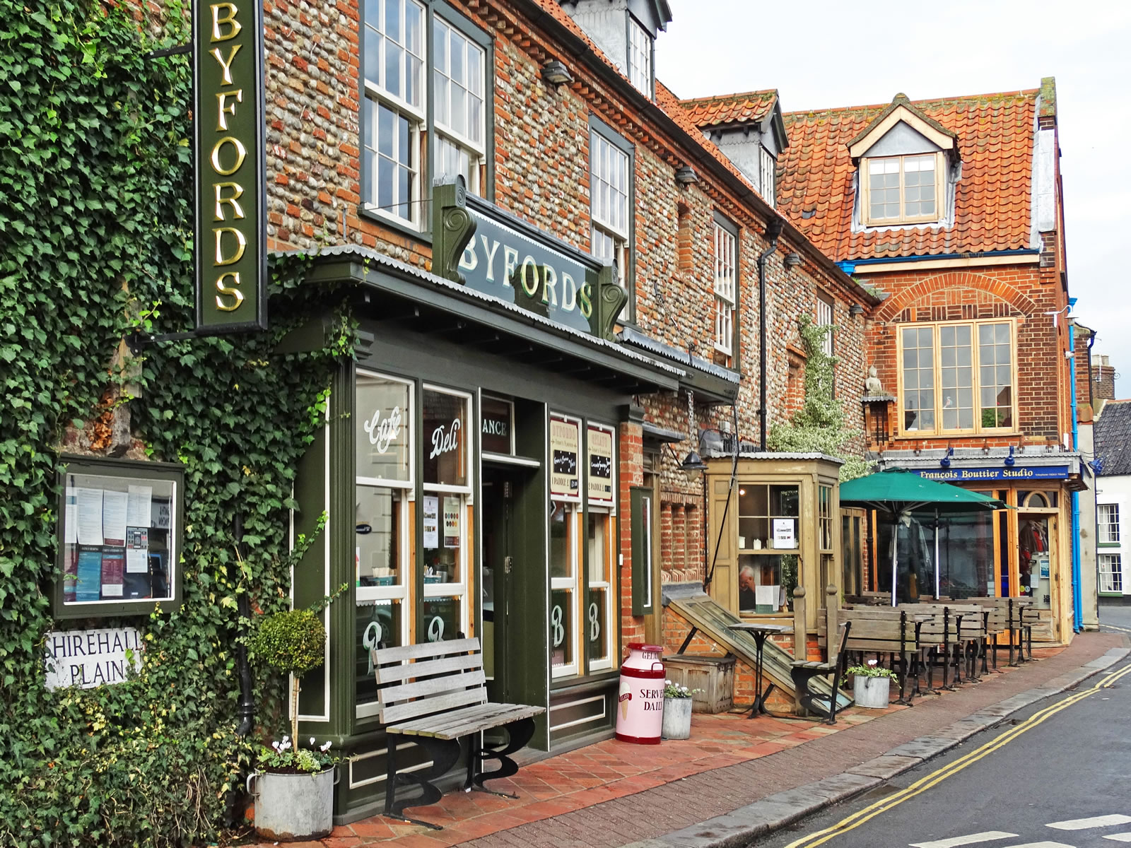
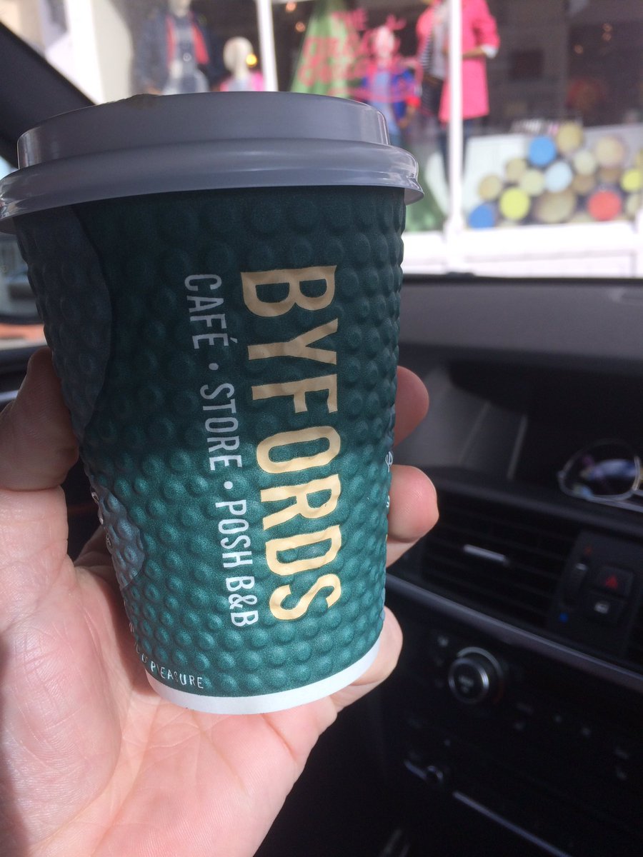
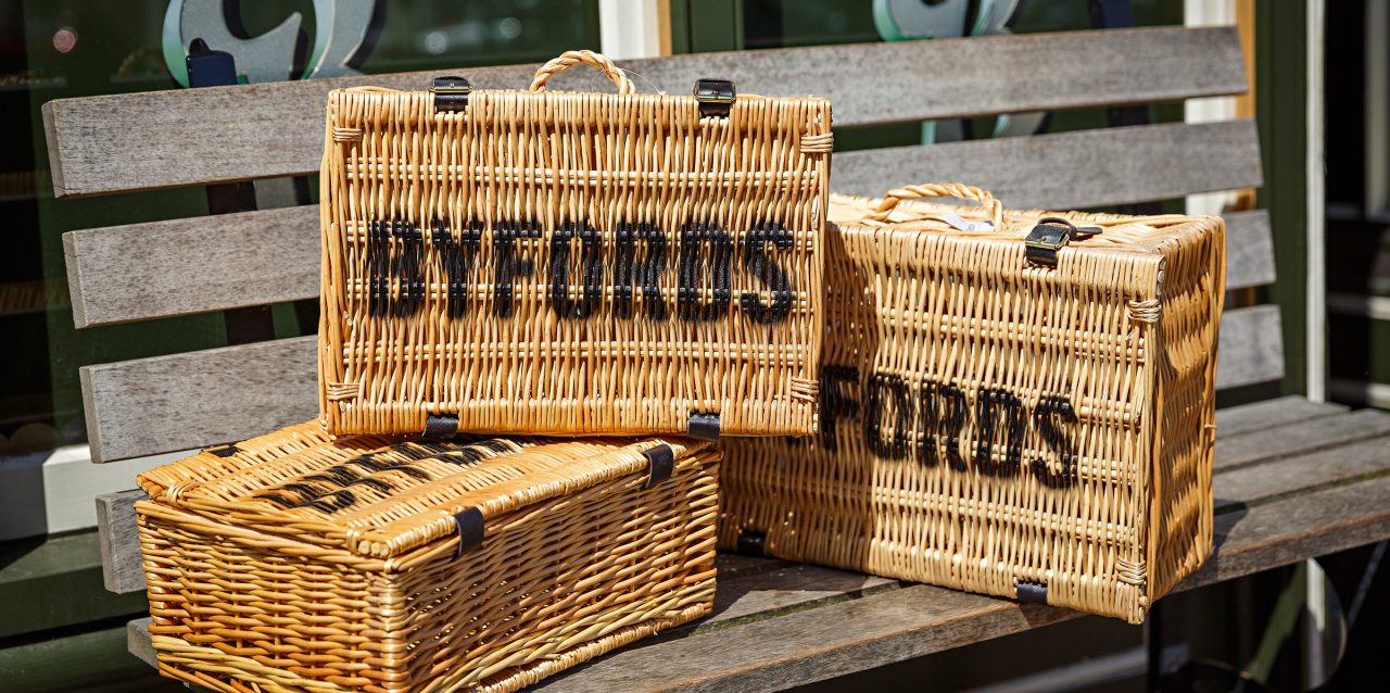
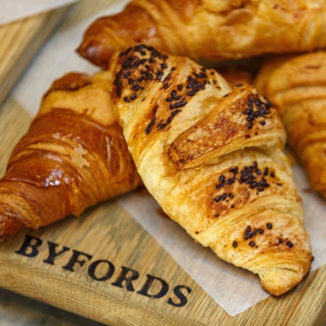
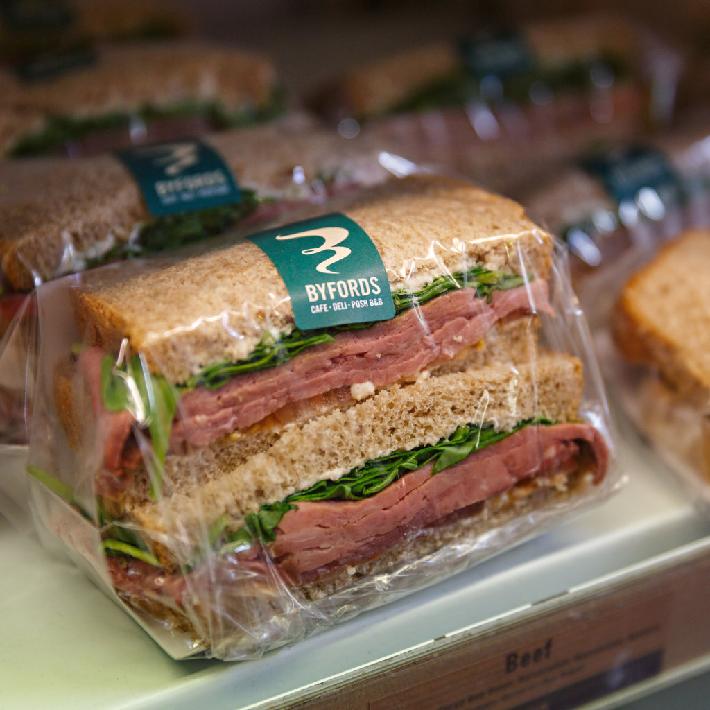
Byfords Deli
Holt, Norfolk, UK
Byfords in Holt is a cafe, deli and hotel in one. Great for a nice sandwich and a coffee if you’re in Holt doing a spot of shopping. The Byfords building has a wealth of character and is believed to be the town’s oldest building being Grade 11 listed. The Byford name also has tonnes of heritage, the premises traded as a hardware store/ironmonger’s for over 100 years under the ownership of the Byford family, from which the building took its name. The Byfords logo colour is distinctly English heritage green but with a modern typeface and a quirky coffee steam motif, the logo is a nice example of giving a nod to the past without looking old-fashioned. Like Eric’s the branding is carried through onto things like stickers to seal the sandwiches, printed serviettes on tables and the takeaway coffee cups. It’s these subtle touches that emphasise a brand to customers and shows a quality that other cafe’s and restaurant fall short of.
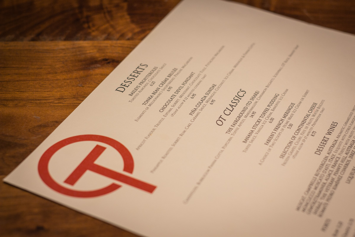
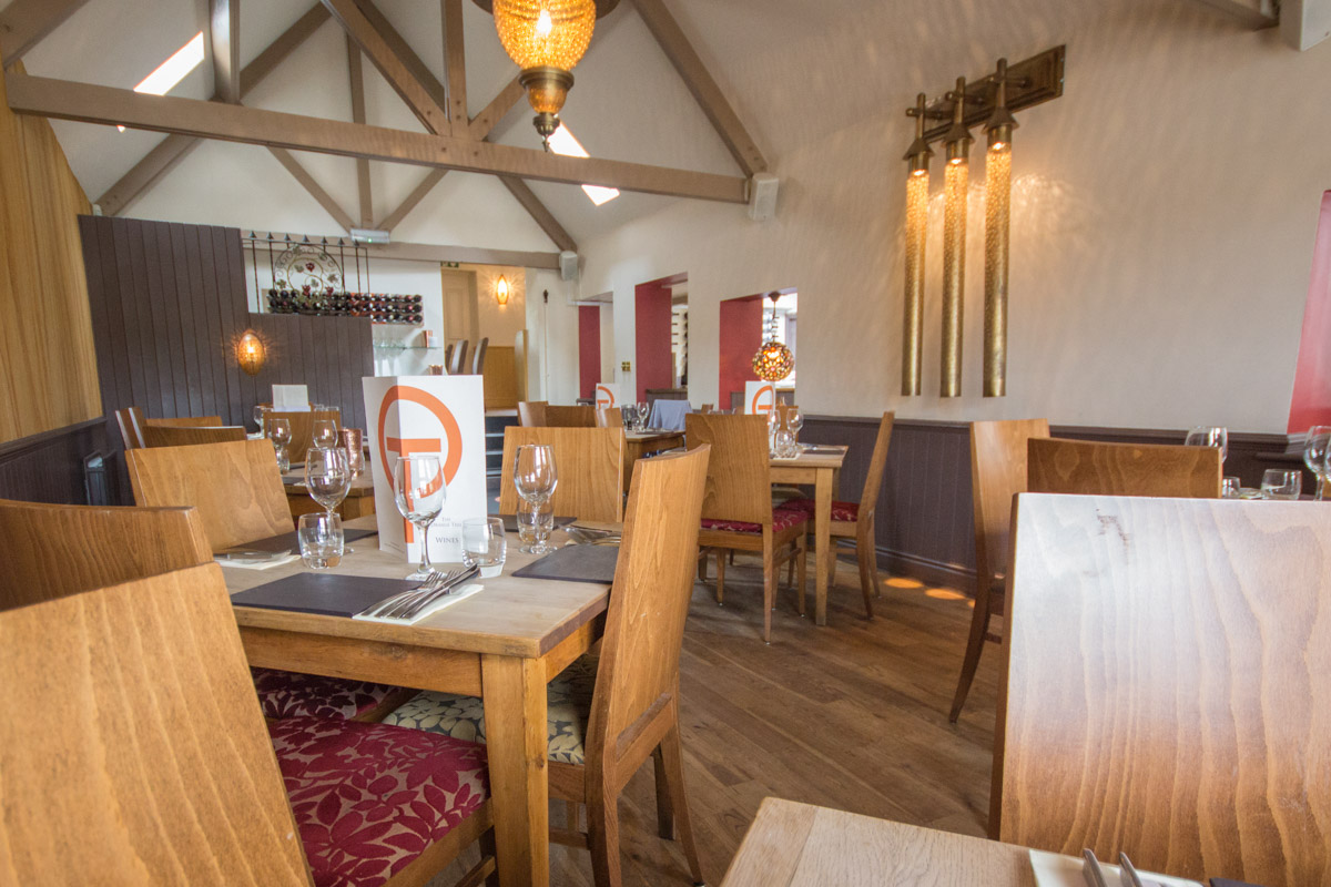
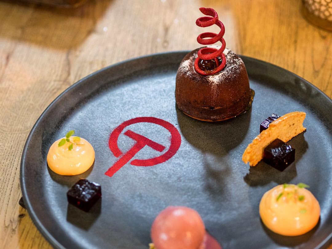
The Orange Tree
Thornham, Norfolk, UK
The Orange Tree is an award winning restaurant and hotel based in Thornham serving great food and drink. It has a nice, simple but clever logo using typography to create the logo mark. You can see that by combining the ‘O’ and the ‘T’ you make a tree shape. Perfect considering the name! Yet again, this logo mark is used on all customer facing material like menus, signage and even as decoration on the food dishes themselves. Very classy!

Now we’re not saying that these examples are the only places that use good design practice for their branding but we only visited North Norfolk, so we’re sure there are plenty more places and we’ll be sure to post about them if we find any more. We think what really drew these examples to our attention was purely their simplicity and the execution of their brands. We here at Brio practice the same beliefs when creating branding for our clients, we believe that simple is always best when conveying a companies identity. Get in touch today if you want awesome.
